One of the primary reasons for using Linux is how it enables you to customize every aspect of the operating system. Unlike Windows and macOS, you can even choose from various desktop environments, each with its pros and cons.
One tiny problem, though, is that to find those “pros and cons”, you must use more than one desktop environment. Then, take notes, and compare them to see which one has the most features you care about.
Or, you could always check an article like this one, which we created precisely for that reason:
To compare the two popular desktop environments and find the pros and cons of going with the ever-popular Gnome or the newer and much beloved Budgie.
So, let’s see which-is-better-at-what, and closer to becoming your daily layer of interaction with your PC.
The Tech Inside
Gnome and Budgie are essentially two heavily morphed mutations of the same desktop environment. Both have evolved from the older versions of Gnome.
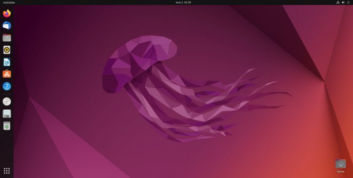
The newer versions of Gnome are theoretically a continuation of the older ones. In practice, though, Gnome 3 threw much of what made Gnome 2 “Gnome” out of the window, prioritizing new interaction paradigms. It was the age when touch screens were all the craze, and Gnome’s developers decided it would be nice to grab a piece of that pie.
Judging by how only a handful of users use Gnome for interacting with touch screens, it would be far from truthful to deem Gnome developers’ endeavor a success. The problem was that Gnome’s usability on a typical desktop with a mouse and keyboard took a hit by prioritizing touch screens.
For example, why waste a significant amount of screen estate for displaying large icons designed for fat thumbs even when using a keyboard and mouse?
That’s when many new “classic Gnome” successors started popping up, aiming to take the mantle and run with it. They all promised a new, improved, unique, genuinely modern desktop. All while still using the classic Gnome as their inspiration (and keeping most of it as the most significant chunk of their code base). Instead of going touch-screen-crazy like the latest Gnome, they presented themselves as “proper” desktop environments. And Budgie was one of them.
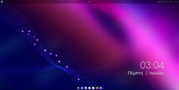
Initially created for the Solus project, the Budgie desktop environment felt like a hybrid of classic Gnome with some strands of KDE’s DNA thrown in for good measure. It followed the traditional desktop paradigm with a familiar taskbar, accompanied by readily accessible widget-like panels, and bundled all notifications together. In many ways, it was a true evolution of classic Gnome for the desktop. But Gnome was still Gnome.
Despite shifting gears and diverging from the path of its ancestors, the newer versions of Gnome were still, at their core, Gnome. New Gnome still had a large army of developers and a massive community behind it. It was a given it would evolve quicker, but also that its most annoying quirks would be found and, eventually, squashed.
Today both desktop environments have started converging again. Gnome isn’t as touch-crazy as before. Budgie has stopped trying to reinvent the wheel. So, how do their current incarnations compare, and which would be better for how you use your PC?
Aesthetics & Personalization
The first thing anyone notices when trying out a new desktop environment is its appearance. However, a desktop environment’s looks aren’t affected by a single factor. Various elements combine to conjure the whole we define as a desktop environment’s looks.
To avoid being characterized as “a Windows clone”, especially after some time in the past Microsoft threatened with legal action for copyright infringement, Gnome mutated its taskbar into a “dock”.
Docks are similar to a taskbar in that they usually appear on one side of the screen, hosting icons for easy access to particular apps. And maybe some extra functions, like jumping between virtual desktops or quickly accessing some folders.
Gnome’s dock shows up by default on the left side of the screen as a vertical bar to further distance itself from the Windows taskbar. Still, it’s customizable, so you can, for example:
- Move it to the screen sides.
- Reduce its length to prevent it from extending across the whole screen (“panel mode”).
- Tweak its colors and transparency.
It might not be a total Plank replacement, but it’s far more customizable than what Windows 11 users have to tolerate.
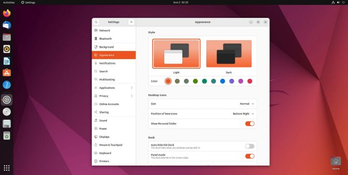
Modern Gnome also enables the user to choose between a light or dark mode for its windows and menus and select a color accent to personalize the desktop’s looks further.
On a surface level, it’s not possible to use third-party window themes, unlike classic Gnome. Nor customize visual details like the width of the sidebars where scrolling is involved.
And yet, such customization is possible, despite Gnome not offering hints about it and actively hiding its configurability. For that, you have to install extra tools, the most popular being Gnome Tweaks. You can then use it to install new themes or customize the elements of the active one.
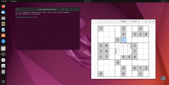
Although this customizability demands you take an extra step and bring additional software on board, it also opens new horizons. All thanks to Gnome’s support for extensions.
- One extension may tweak the minimize, maximize, and close window buttons.
- Another may work as clipboard managers.
- A third one could attach a Pomodoro timer in the desktop’s tray area.
By mixing and matching extensions, you don’t only change how your desktop looks but also how it “works” and “behaves”. You don’t have to long for missing functionality. Nor worry about the resources eaten by features you never use. Instead, you can use the desktop equivalent of LEGO bricks to “assemble” your personal desktop environment piece-by-piece.
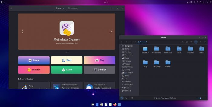
Since Budgie is based on Gnome, it’s not surprising how the two desktop environments share many elements. That also extends to many of their visuals. Both use the GTK toolkit, which explains why their windows and other details (buttons, bars, menus) look similar. You can even make them look identical by using the same wallpaper and fooling around with themes and visual settings.
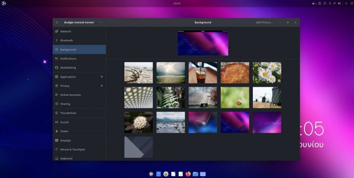
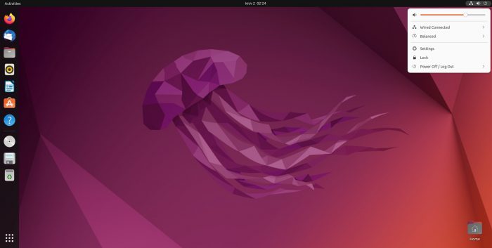
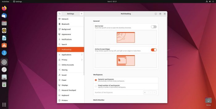
Like Gnome, Budgie divides its always-on interactive elements into two, to use a single term for everything, panels. On Gnome, there’s a dynamic apps panel (by default) on the left side of the screen. It presents a mix of pinned and active app icons, enabling you to launch them or juggle between them.
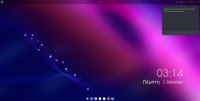
The same (more or less) functionality on Budgie is accessible from a bottom panel (actually, it’s the well-known Plank launcher). However, it appears (by default) more compact and floating on the bottom middle of the screen (but you can change that behavior and appearance if you wish).
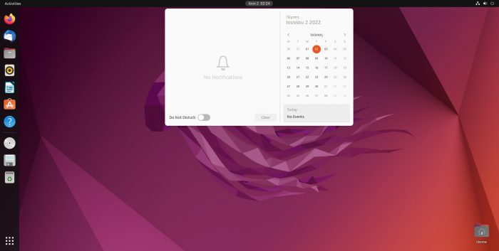
Both desktop environments also present a top panel, where you can find a clock, notifications, and tray icons. Their arrangement is different, though. For example, Gnome bundles its notifications and calendar in the center of that panel. Budgie only presents a clock in the center bundled with a shortcut for quick access to the calendar app. It moves everything else to a “tray area” on the right and its panels “sidebar”.
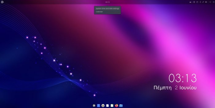
Also different is the placement of the ever-important let’s-call-it-apps-button (the equivalent of the Windows Start button). On Gnome, it’s accessible from the bottom of the left “apps” panel. On Budgie, it’s on the left of the top panel.
Gnome is easier to personalize, but that’s essentially because it doesn’t expose many such options to the user. Budgie, on the other hand, comes with a dedicated customization utility for the purpose: Budgie Desktop Settings.
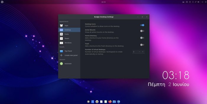
The Budgie Desktop Settings means you don’t have to hunt down extra tools or individual extensions for Budgie to make your desktop look as you wish. If you want to use an alternative icon pack or disable animations, Budgie Desktop Settings allows such tweaks and more.
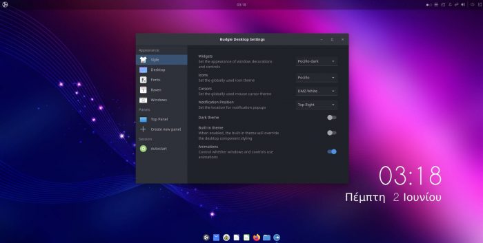
You can tweak not only every aspect of the desktop’s visuals from the same tool but also enable functionality like Budgie’s support for tiling windows.
Budgie’s tiling and window management aren’t an afterthought but one of its core features. Its Window Shuffler Control app allows you to customize dozens of keyboard shortcuts for moving around and snapping windows on the screen. You can create and manage multiple window layouts, create and customize window rules that define where and how any window should appear by default, etc.

So, do you believe the best way to use a desktop is by having windows tile automatically or appear on predefined spots? Do you hate having to micro-manage the placement of floating windows? Budgie seems like the best choice for you. Except if you don’t mind investing the time and energy to add third-party tools or slap some extensions on Gnome.
Interaction & Usability
After you get familiar with them, both Gnome and Budgie achieve what should be considered the best praise for any desktop environment: they “fade into the background”. They become the graphic layer that facilitates your interactions with your computer without getting in the way. Still, that doesn’t mean they’re identical or do things the same way.
Initially, Gnome looks like the most straightforward and accessible of the two. Especially for anyone who’s used a smartphone in the last decade. Looks can be deceiving, though. In many instances, you may find Gnome stumbles while striving for simplicity.
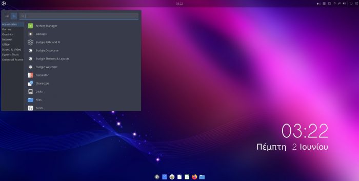
Here’s an example: the apps button gives access to all installed software on both desktops. On Gnome, it presents a list like the one you’d see on an Android smartphone, with large icons for most apps presented alphabetically. And ample space (arguably “wasted”) among them.
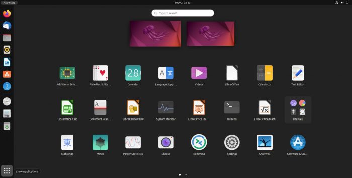
Budgie does the same by default but doesn’t cover the whole screen with large thumb-friendly icons. It recognizes that most users will be using their mouse and keyboard to interact with it. Since those devices offer a much higher level of precision, Budgie doesn’t have to use too much space for its interactive elements.
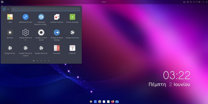
Plus, you can switch Budgie’s apps menu to a secondary display mode to “turn it classic”. This way, you can see all menu entries organized in sensible groups: Graphics, Internet, System Tools, etc. That makes it easier to find what you’re seeking if you can’t guess each piece of software’s purpose based on its name.
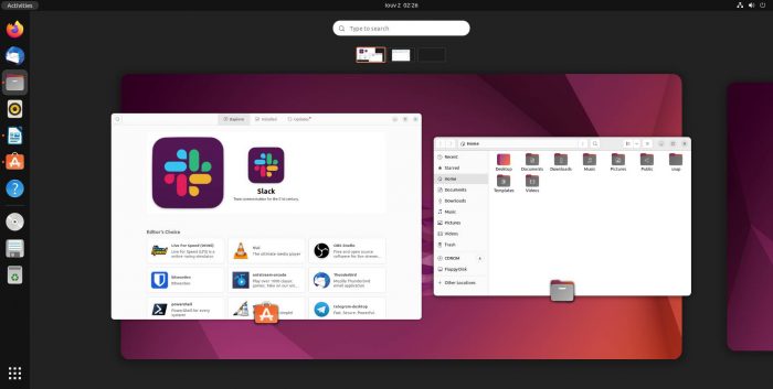
Gnome’s Activities menu allows you to locate apps quickly. If they’re not running, you can launch them from there. If they are, you can switch to their window. And you can also manage virtual desktops and move app windows between them.
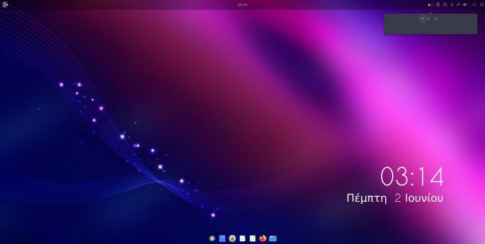
On Budgie, you can locate and run apps from the apps menu. You can use an icon on the top panel’s tray to switch between active virtual desktops. That’s “the expected way to do this” for everyone who’s ever used any classic desktop environment up to Gnome 2. Or XFCE. Or MATE. Long story short, it’s a tried, proven, and, more importantly, familiar approach.
Gnome’s bundling of app accessibility and desktop management doesn’t make sense if you love the classic usage paradigm. In action, though, it makes working with multiple apps a breeze. It turns the same menu into a “navigation hub” for every piece of running or not-yet-loaded software.
Still, we can’t deem one approach better than the other, for it’s a matter of preference.
- Gnome creates virtual desktops automatically by default.
- Bungie goes for the manual approach, with a fixed number of virtual desktops you can tweak if you wish.
- Gnome creates virtual desktops “as you need them”.
- Bungie defaults to granting the user absolute control over the process.
- Gnome’s more “liberating” but also more “chaotic”.
- Budgie’s more “organized” but also expects you to define your own limits.
That, up to a point, is the main difference between the two desktop environments.
- Gnome tries to guess what most users would prefer beforehand and hide anything they probably wouldn’t use. “To make the PC as easy to use as a smartphone”.
- Budgie offers more control, but may also seem more “old-school” and complicated to newcomers.
It’s up to you to choose which camp you prefer.
Features
Like many other aspects of both desktops, we could summarize their feature set as “similar, but different”. As a spoiler, and based on first impressions, Budgie offers “more” out of the box.
This “more” begins with the Budgie Desktop Settings control panel we mentioned earlier. That’s thanks to it enabling the customization of features like Budgie’s support for automatic tiling or how the tab switcher displays window previews.
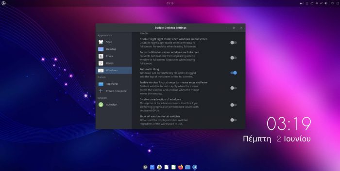
Let’s not fool ourselves; nobody reads manuals nowadays. By offering options related to some not-really-obvious features, Budgie renders them discoverable. Suppose users see an option for feature X they didn’t know existed. Intrigued, they might wonder how it works, try it out, find it usable, and incorporate it into their daily workflow.
By opting for “hiding the fluff”, Gnome is the opposite: anyone can start using it ignorant of the power hidden under its metaphorical hood. We don’t have numbers, but we’d feel safe to bet that only a tiny fraction of actual Gnome users have ever used even a single extension.
And yet, although Budgie still offers some unique features, they’re slowly but surely fading. For example, its originally much-touted sidebar (and the applets living there) today can be all but ignored.
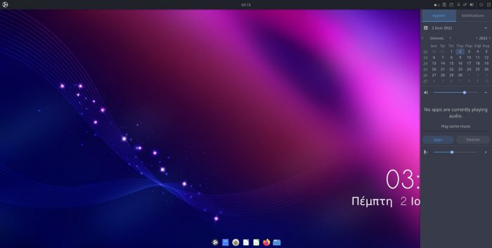
Similarly, after forking it from its original bound-to-Solus code, Budgie’s developers are now downplaying its unified notifications system, Raven. Instead, they’re praising how rewriting their Notification Server and moving it out of Raven actually improves its capabilities.

The Basics
Since Gnome and Budgie share a lot of code, they share many features we’re purposefully skipping. Why have this article balloon to the size of an ebook to cover features like:
- Fractional Scaling.
- Fully multilingual interface and dialogs.
- Color profiles for individual monitors.
- Advanced integration and support for all GTK-based apps.
- Extensive and ultra-customizable accessibility features. They range from displaying elements in high-contrast or enlarging text to playing sounds on keypresses and presenting visual alerts.
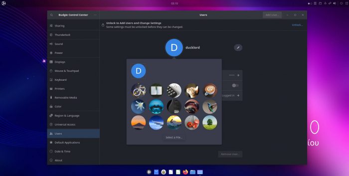
- Easy user management and account personalization.
- Individual audio device control.
- Customizable Workspaces with support for multiple monitors.
- Automatic screen brightness and “color warmth” management for reducing blue light emissions (“Night Light”).
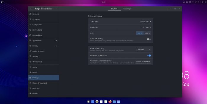
The above is almost a given for any Gnome-Compatible desktop environment. Devs would have to actively work to remove support for some of those features.
Performance
Ask anyone using computers for some time, and they’ll tell you performance is not only about numbers.
Budgie seems to be the “lighter” desktop if talking solely based on factual data. During our tests on both virtualized and actual hardware, Budgie seemed to have lower demands and needed fewer resources. We saw less memory and CPU utilization.
But that doesn’t tell the whole story.
Budgie is what you’d say “lighter”, but claiming it’s also “quicker” in every regard would be a lie.
Yes, Budgie seems to perform somewhat quicker on older and more underpowered hardware. For some reason, though, we also saw increased paging (AKA: storage utilization) under the same usage scenarios during our testing. So, if your storage’s slow, performance may also take a significant hit, even if your CPU, GPU, and RAM aren’t the culprits.
BUT…
If you have enough RAM, and your CPU blazes through anything you throw at it, then the OS won’t have to rely as much on paging, so it will perform quicker. And it also depends on what software you’re using and how. It’s one thing editing a single thumbnail in GIMP; it’s another creating an 8K wallpaper with hundreds of layers.
Then, there’s also the perception of performance. Gnome feels smoother in active use but with some lag. The more underpowered the hardware, the higher the perceived lag.
Budgie feels “snappier” but is also the opposite: the more powerful the hardware it runs on, the “clunkier” it feels when windows pop up or move around.
We must stress that this is not about “which one is lighter on resources”. We’re talking about the perceived performance, the “feeling” of your computer responding to you. It’s similar to how a racecar might react to the wheel’s “commands” compared to an electric sedan.
- The racecar feels quicker when burning rubber over a straight line but jerky and demanding more “user input” when entering a tight corner.
- The electric sedan is a more comfortable ride, helping you with “assistive technologies” instead of making you feel like trying to tame a wild horse.
That’s precisely how using Budgie or Gnome feels, respectively.
Still, if you’re strictly interested in numbers, and demand a simplified answer, here goes:
“Budgie seems to use somewhat fewer resources”.
That translates to around 1.5-1.7 GBs of RAM and 24% CPU utilization when idling with Firefox loaded. For Gnome, the numbers change to 2.2-2.5 GBs of RAM and 32% – 35% CPU utilization.
And the Winner is…
As we saw, there’s no real “winner” when comparing Gnome VS Budgie. They might rely on the same core technologies, but they diverge enough to mutate into wholly individual choices.
Pro Budgie
- Budgie seems to be the better option if you want more customizability, but not the option overload offered by KDE.
- If you work primarily with the keyboard or use only a handful of apps, you’ll like Budgie’s “zippiness” – and probably not even notice its “clunkiness”.
- If you’re juggling dozens of windows daily, Budgie offers better manual control of your windows, desktops, and workspace. To clarify, that’s when sticking with the defaults. If you start customizing and extending Gnome, that’s a different story that could have the opposite outcome.
- On older and more underpowered hardware, Budgie feels snappier. As the hardware improves, the situation changes, favoring Gnome.
Pro Gnome
- If you’re using your computer casually, with a different app on the screen at any moment, Gnome’s better when switching between them through GUI elements (“by clicking on buttons”). Keyboard warriors will still prefer Budgie for that (thanks to its window tiling management shortcuts).
- Do you regard “changing the wallpaper and window color” as more than enough customization? Gnome’s for you.
- If you believe automatic virtual desktop creation and a multi-purpose dock are “helpful” instead of getting in the way, go Team Gnome.
- Gnome’s devs have been optimizing and tweaking it for ages. After release, Gnome 3 felt too “heavy” compared to its ancestor and most alternatives. Today it’s much closer to most “lite” desktop environments. However, that’s on relatively performant hardware. It’s still true that the older or more underpowered your hardware, Gnome alternatives (like, surprise, Budgie) can feel more responsive.
So, which one will you choose? Do you prefer customizability or “automation”? “Smoothness” or “Zippyness”? The racecar or the electric sedan? It’s your decision, but we’d love to hear more about it.