They’re small, come by default with our Desktop Environment, and we don’t overthink about them. And yet, the icons on our desktop can make or break its looks.
As Apple fans know, looks matter. A great icon, wallpaper, and desktop theme combination can elevate your operating system’s aesthetics and make your computer a joy to use.
The icons in Ubuntu have indeed improved over the years, version by version. And yet, there are still better alternatives. Let’s see seven of the best Full Icon Themes from Gnome-Look that you can use to upgrade your Ubuntu desktop.
How to Install Themes in Ubuntu
You can install all the icon themes we’ll see the same way.
If you want to install an icon theme only for personal use, you’ll have to place it in a hidden folder called “.icons” inside your Home folder. If it doesn’t exist, create it by firing up your terminal (CTRL + Alt + T for the default one) and issuing the following command:
mkdir ~/.iconsWould you prefer to install an icon theme “system-wide” and have it usable by everyone who shares your computer? You’ll have to copy its files into the “/usr/share/icons” folder instead.
Most themes come in compressed archives, which you will have to extract. For that, while in the terminal, visit the folder where you stored the downloaded archive, using the “cd” (Change Directory) command, as follows:
cd PATH-TO-DIRECTORYIf, for example, you save the downloaded archive into your default Downloads folder, you can use the command:
cd ~/DownloadsTo extract (most) icon themes, you can then type:
tar xvf NAME-OF-DOWNLOADED-ARCHIVEOf course, you’ll have to replace “NAME-OF-DOWNLOADED-ARCHIVE” in our example for the actual name of the file you’ve downloaded.
Installing an icon theme is half of the battle, for you’ll then also have to activate it. Unfortunately, that’s not easy with the default options available in Ubuntu’s Settings. Thus, you’ll have to install an additional tool, Gnome Tweaks. While still in the terminal, use the following commands to bring on-board Gnome Tweaks, as well as some useful extensions for Ubuntu’s Gnome desktop:
sudo apt install gnome-tweak-tool

sudo apt install gnome-shell-extensions
With that out of the way, let’s move to the themes themselves.
Flatery
https://www.gnome-look.org/p/1332404
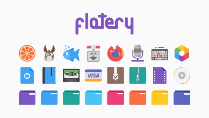
As its name implies, Flatery is a “flat” theme, prioritizing “readability” over fancy effects. Every line, shape, detail, is clearly visible. Flatery uses muted shadows to give the illusion of depth or volume only where it’s needed.
There are almost no gradients (except for some accents, like in the fox’s tail in Firefox’s logo), and zero effects like tacked-on transparencies or retro gradients.
Flatery is an excellent option for desktops where clarity is a priority, without aesthetics taking a back seat.
Tela
https://www.gnome-look.org/p/1279924
Tela is another flat icon theme, but doesn’t try to reinvent the wheel on its own. Instead, it remixes and expands the established Numix, Papirus, and Paper icon themes.
Tela supports all major Desktop Environments, from Gnome and Plasma to MATE and XFCE4, and comes with dozens of icons for most popular apps, from Firefox and Chrome to LibreOffice and Visual Studio Code.
Despite following a relatively minimalistic approach, it’s also vibrant and colorful. Still, it doesn’t feel as if it’s “trying to steal the show” from other on-screen elements to the point of becoming annoying.
Papirus
https://www.gnome-look.org/p/1166289
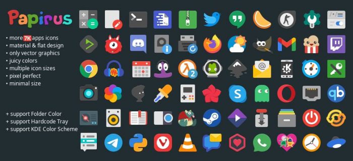
Papirus is one of the most popular collections of icons on the whole green and blue globe we call home, and with good reason.
A force to be reckoned with, Papirus comes with over 7000 icons that cover the most popular software available on Linux. Audacity? Skype? Transmission? VLC Player? Inkscape? They’re all in. It even comes with icons for games like Half-Life 2, Counter-Strike, and the indie-favorite, Limbo.
Of course, it also offers multiple color variations for folders to enable you to personalize your desktop precisely how you want it. Yeah, there’s a variant matching the Yaru DE theme, but why stay there when you could shake things up with full-black or even Teal, Indigo, or Pale Orange folders?
As for its approach, it’s another “flat” theme, forgoing shadows, transparencies, and ultra-complex shapes, to promote visual clarity.
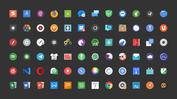
Fluent
https://www.gnome-look.org/p/1477945
We should thank Windows Vista for making desktop effects feel like the evolution of Geocities atrocious in-your-face pages of ages long gone. And it was primarily thanks to Google’s Android maturing and swapping its random visuals for a unified and simpler design that “flat” icons are so popular today.
Combined, those elements make for desktop environments that “fall in the background” and disappear, leaving the user with their apps. Just as it should be, since we’re not using desktop environments solely for looking at them. The desktop is the means to an end, a visual metaphor for easier interaction with our computers.
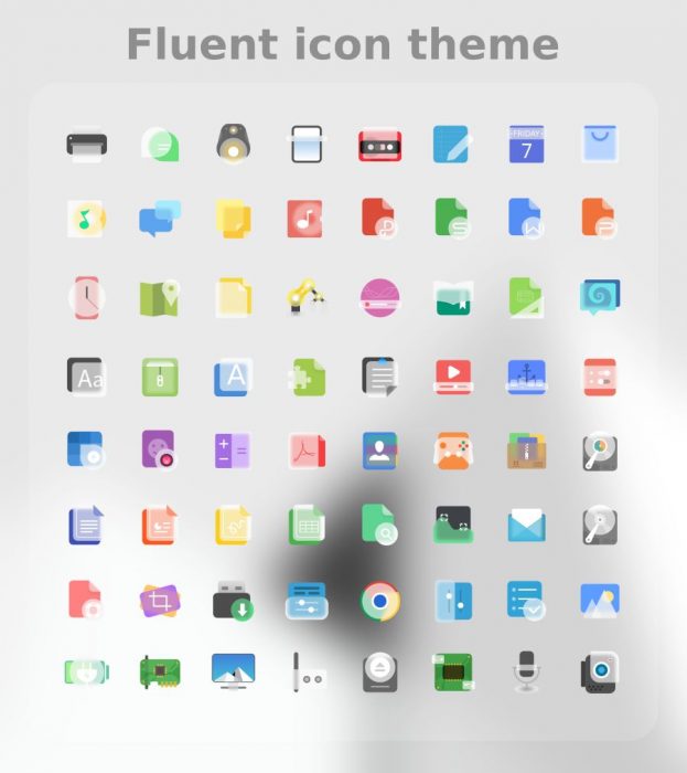
However, sometimes it feels as if things have gone too far. Many modern flat icon themes feel too simplistic, failing to convey their intended message. That’s where Fluent comes in.
Fluent in another flat theme, but well… “Not too flat”! It’s not afraid to incorporate shadows and some gradients in some of its icons, but always only where it makes sense to do so.
It comes with dozens of icons for the system and most popular pieces of software, and primarily supports Gnome and KDE.
Zafiro
https://www.gnome-look.org/p/1209330
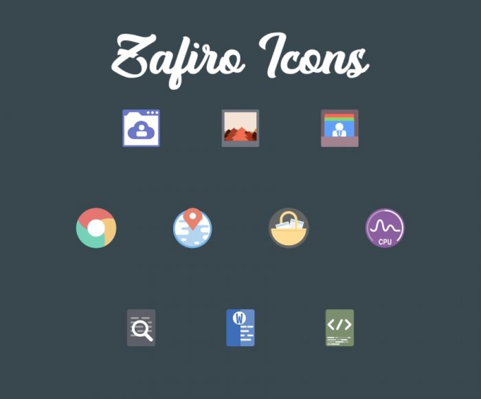
The opposite of Fluent, Zafiro is another flat icon set. However, instead of backtracking on the simple aesthetics to present richer visuals, it goes for even simpler shapes and more unified colors.
In other words, it’s perfect for minimalistic desktops, where there are only a handful of visible icons, if any, for apps that you can count on your fingers.
That essentially justifies how it also contains a smaller number of icons than other options. It’s not rare to miss an icon or two (or three, four…) for your installed apps. You can replace them with select choices from other icon sets, but those who usually choose Zafiro wouldn’t. They’re the keyboard warriors, the Linux masters. They’re those who only need a small number of icons for a handful of apps. Their goal, to spice up their desktop in those rare instances they minimize their terminal.
Buuf
https://www.gnome-look.org/p/1012512
Glossiness, gradients, shadows, and transparencies might not be the best elements for icons. Still, does that mean that everything has to be ultra-simplified? Are flat icons the only sensible choice for a modern desktop, with alternatives looking as if they were pulled out of Vista?
Well, no, and we’ll let you in on a little secret: the popularity of the flat aesthetic isn’t only because of its inherent readability but also because it’s easier for designers. It’s easy placing a triangle over a rectangle, painting one red and the other blue, and slapping a “Home” label on them. It’s much harder sketching one in a way that wouldn’t look out of place in one of Disney’s flicks.
And yet, Buuf pulls it off. It’s one of the rare instantly recognizable icon sets, with a somewhat cartooney – or, rather, painterly – aesthetic. Combine it with an appropriate wallpaper, and your desktop can look like one of Uderzo and Goscinny’s panels out of Asterix’s adventures.
Buuf is primarily compatible with GTK and comes with a large set of icons – but may still miss one or two of the apps you’re using. Unfortunately, Buuf’s unique looks make it hard to find proper replacements.
Simply Circles
https://www.gnome-look.org/p/1277095
Are you going for an ultra-minimalistic approach where even the most streamlined flat icons would look like blasts of color? Then, you might want to look at Simply Circles.
Simply Circles abstracts detail to the breaking point and uses colors only as accents, only where it would be impossible to convey an icon’s purpose without them. However, it’s worth noting that it does offer color variations that allow you to find the perfect match for your desktop theme and wallpaper.
All its icons present simple shapes inside, as you might have guessed, circles. Still, it comes with a tiny problem. Because it’s stylized (AKA: simplified) as much as possible, many icons are unrecognizable in small sizes. Thus, it’s not the best option if you prefer your icons on a small-height dock attached to one side of the screen.
Three More Options
We believe our main icon theme selections will cover most people’s needs. Still, we also felt it would be a disservice to skip the following icon sets, which are worth looking into if you’d like more alternatives.
Flat Remix
https://www.gnome-look.org/p/1012430
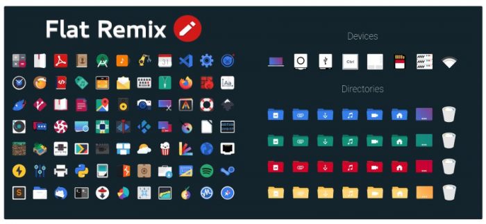
Many other icon sets are based on Flat Remix, which they either expand or remix. For many, they’re just contenders to the throne, with Flat Remix still being the one true icon set to rule them all.
At least, the flat ones.
Flat Remix comes with hundreds of icons in dark and light versions and multi-colored folder variants, making it a given you’ll find a combination that works for you.
UOS
https://www.gnome-look.org/p/1349376
If you’re going for Mac OS looks on your desktop and wonder why everyone’s skipping gradients and shadows to go for ZX-Spectrum-like graphics, you’ll love Uos.
Uos doesn’t mimic Deepin’s colorful and detailed icon set. It is Deepin’s icon set, pulled out of its v20 beta and ready-to-use in other desktop environments.
Xone
https://www.gnome-look.org/p/1218021
Designed to look perfect on any screen size and resolution while remaining “readable” and clean, Xone is suitable for any desktop but especially great for multi-monitor setups.
Are you using two or more monitors of different sizes and resolutions simultaneously, with your desktop spread across them? Xone’s ability to look great at any size makes it the perfect choice for your usage scenario.
And yes, it also comes with an eye (and OLED) – friendly dark theme.
Tiny but Wonderful
Indeed, you don’t need a different icon set than your desktop environment’s default. Plus, most modern desktop environments also come with more than one, among which you may find one you prefer.
However, Linux is all about customization, and an icon set can play a central role in making your desktop truly your own. Each of us has different preferences, and taste can be subjective. What works for one might be someone else’s nightmare material. One looks at Simply Circles and thinks, “it looks cool”. The very same icon set might trigger another’s trypophobia.
We’re sure you’ll find an excellent option for your desktop among our choices. Do leave us a comment about the one you went for, or if you’d like us to find more icon sets worth looking into/at.