You finally decided to take the plunge and see why Ubuntu remains one of the most popular Linux distributions for decades. You downloaded it, installed it, fired it up, and are now looking at its desktop, wondering: what is this crap?
Ubuntu’s default desktop environment is a customized version of Gnome 3. Unfortunately, Gnome 3 is significantly different from the classic desktop recipe. If you were used to other desktop environments, Gnome 3 might feel as restrictive as a smartphone.
Thankfully, Ubuntu is a Linux distribution, open-source, and as such, allows you to do whatever you want with it. In other words, you have options. You are not stuck with Gnome 3. Why spend the time and effort to learn how to use your desktop when you can use a desktop environment that works the way you want? So, let’s see some of the best alternatives to Ubuntu’s default desktop.
What is a Desktop Environment?
If you just came to Linux from Windows or Mac, the option to change your whole desktop environment might seem otherworldly. How is that possible? Isn’t what we call “the desktop environment” an irreplaceable part of the operating system itself? Well, the simple answer is no.
The desktop environment is what you could call “the graphics shell”, which enables the user to interact with the core operating system with their keyboard and mouse.
- It all begins with the core Linux operating system and everything you might know from your interactions with it through the terminal. That’s the primary way to work with Linux: by typing commands and reading their output.
- X Windows “sits on top” of the core Linux operating system, taking advantage of the computer’s GPU to create a rudimentary foundation of graphics elements. In natural language, this means “X Windows gives Linux the capability to display buttons and windows. It also enables Linux to understand where you are pointing your mouse, or forward what you are typing on your keyboard to specific windows”.
- A Window Manager comes as an extra layer over X Windows, expanding its scope. It’s the part of the desktop equation which controls how windows might look, how you interact with them, and so on.
- Finally, the Desktop Environment is the whole shebang. It combines a particular Window Manager with a group of applications either built with its toolkit or tested extensively to ensure they “play nice” with it.
- The “toolkit” we mentioned is a collection of elements, libraries, and other pieces of ready-to-use code. Developers can use it to create graphical applications painlessly. That’s why you might see some applications offering almost identical versions for the two most popular toolkits, GTK, and Qt. Apps made with GTK will look right at home on desktops based on it, like Gnome and XFCE. Those made with Qt look their best on KDE’s plasma desktop.
Precisely since with Linux, you are free to customize everything as you wish, you can skip the desktop environment altogether. The pro is that each layer adds more functionality and enables you to interact in more ways with your computer. The con is that it also increases complexity and demands more resources. Your options, with each step adding more features & complexity, are:
- The terminal: you’ll only interact with your computer through keyboard commands.
- X Windows: you’ll have rudimentary multitasking capabilities – for example, you could have a window displaying an image next to one with an active terminal.
- Window Manager: you’ll have an experience close to what you’d expect from something like Windows 3.11, or maybe 95. You’ll be able to juggle multiple windows and perhaps even get a taskbar. “A taskbar” that might even come with a notification area and clock! Hurrah!
- Desktop Environment: everything you expect from a modern computer. You get everything a Window Manager offers, plus all the essential apps we expect as “The Defaults” from modern OSes. Those who use their computers only for casual browsing, notes, and editing some documents, might not even have to install anything at all.
Which are the Best Desktop Environments for Ubuntu?
We’ll be the first to admit that you shouldn’t expect any surprises from the entries on our list. We agree with the officially recognized Ubuntu flavors on which are the best Desktop Environments today. You can find many similar lists online or check each Ubuntu flavor’s official site to learn more about each Desktop Environment.
That’s why we chose a different path for our list. Instead of talking about Desktop Environments, we’ll explain the Desktop Experience you should expect from each of them.
Gnome 3: Default for a Reason
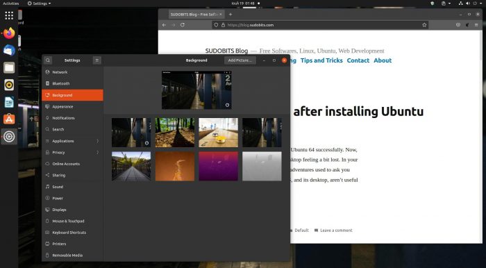
Gnome 3 followed in the footsteps of Ubuntu’s previous Desktop Environment, Unity. Thus, both were criticized for the same reasons: they tried to turn our beloved desktops into smartphones!
This is still true today, with Gnome 3 being worse than the alternatives when juggling multiple windows, jumping from app to app. However, that’s not how all of us use our computers: there’s always grandma!
Nobody can argue that Gnome 3 truly succeeds in simplifying how you interact with your computer to the point of stupidity. It’s proof that Linux does offer a desktop everyone can use nowadays. With it, grandma won’t ever have to deal with complex settings or that dastardly terminal. Since she’ll never need them, she’ll never meet them.
We believe the other alternatives are better for everyone who wants even more control over their desktop, though, or multitasks a lot.
KDE Plasma 5: Take Back Control of Your Desktop
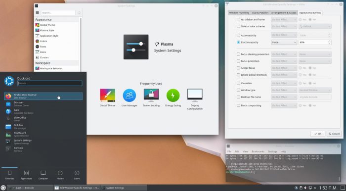
KDE always offered control on almost every aspect of the desktop experience. Unfortunately, many believed its fourth incarnation finally jumped the shark. KDE 4 was considered proof that too much customizability could become a significant con. Thankfully, that’s the past.
The modern iteration of KDE’s Desktop Environment, Plasma 5, offers the same customizability and a vastly better user experience. Its creators managed to find a path between the two extremes. On the surface, they offer instant access to everything you need. Look deeper, and you’ll find all the settings and options you won’t visit daily hidden in expertly organized menus.
They somehow also managed to keep KDE’s stunning looks while lowering its demand for resources. The most customizable, feature-rich, and effects-heavy Desktop Environment, demanding fewer resources and feeling zippier than the until-recently-“lite” XFCE? That’s not code, that’s magic!
MATE: Gnome, Evolved
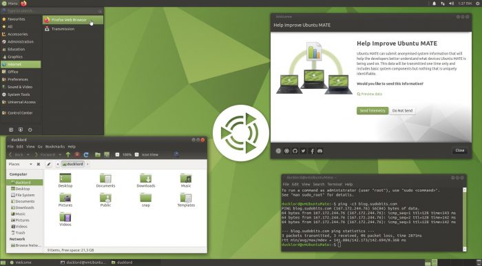
When Gnome 3 appeared as the evolution of Gnome 2, a significant number of people didn’t rejoice. Gnome 3 was too much of a change, and they preferred their classic desktop. However, Gnome 2 was already getting old in the tooth, and Gnome 3 wasn’t a proper replacement. Enter MATE.
MATE began as a fork of Gnome 2, intending to offer a valid alternative to Gnome 3. However, it’s not wholly independent since they both use the GTK toolkit.
Apps made for MATE work perfectly on Gnome 3 and vice-versa. Technology-wise they’re both at the same level. What’s different is that MATE follows the classic desktop paradigm, with a familiar taskbar, main menu, and tray area.
MATE is by default more customizable than Gnome 3, coming with more options for tweaking things to your liking. Whereas Gnome 3 is friendlier to absolute Linux beginners, MATE is designed for seasoned users. For all those who want more control over their desktop, without useless fluff.
Cinnamon: The Modern Desktop You Know
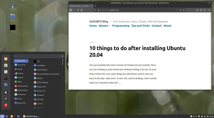
Cinnamon followed a parallel path with MATE, with both evolving as Gnome 2 alternatives – and both becoming two of Linux Mint’s official desktops. However, it’s easier to understand how they differ by looking at the desktops of two different versions of Windows: Windows XP and Windows Vista.
Many still use Windows XP, thanks to its simple but intuitive interface. Windows XP’s desktop worked similarly to its ancestors but didn’t look as “plain” as them. It was familiar but not tired, straightforward, but not dull.
Windows Vista’s desktop was the exact opposite: overloaded with graphics and animations. An ultra-glossy and resource-demanding experience that prioritized looks over purpose.
Well, unfortunately, Cinnamon initially offered an experience closer to Vista than XP. It felt slower than the alternatives. The prioritization of aesthetics over substance was apparent by “tiny” problems like elements on the taskbar suddenly disappearing. Many thought MATE had won as the best new Gnome 2 alternative. But the race hadn’t ended yet.
Just like Windows 7 was a mature and improved version of Windows Vista, today’s Cinnamon is a different beast than its initial versions. Cinnamon acts and feels like a perfect hybrid of Gnome 2, Windows 7, and Windows 11 before it even became a thing.
Still, MATE and Cinnamon are like different sides of the same coin, one prioritizing usability, the other aesthetics.
Note: Our screenshot is from Linux Mint instead of Ubuntu. Linux Mint comes with Cinnamon as its default desktop, and is fully compatible with Ubuntu.
Budgie: A Desktop For The New Age
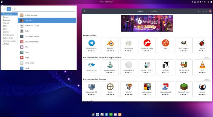
Budgie also uses GTK, like MATE and Cinnamon. That’s why in many ways, it feels like their sibling: because it is. However, it’s also close to Gnome 3 in that it occasionally shakes up the desktop formula. In other words, the classic and the ultra-modern, two extremes, happily co-existing under the same roof.
For example, in past versions, Budgie presented all its settings in a side panel instead of a typical window. Like almost everything in Budgie, this approach looked beautiful and original. Unfortunately, it also didn’t work so well in action since it restricted the whole user interface to a tiny slice of the screen. You could only tweak the handful of options that could fit in this slice, and there was a lot of scrolling up and down, entering and exiting sub-menus.
Today Budgie seems to have taken a step back to not feel as “experimental” as before. The constant is that it’s still worth taking for a spin.
XFCE: Classic, Simple, and Featherlight
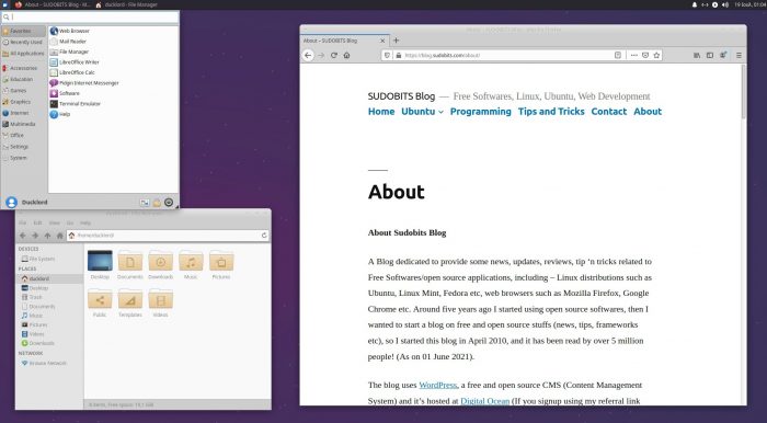
Despite KDE Plasma 5 being unbelievably light on resources, XFCE remains one of the most lightweight Desktop Environments. However, that’s because it offers fewer features than alternatives. You don’t need to be Sherlock Holmes to deduce that fewer features = lower demands on resources = snappier experience.
XFCE’s more fanatic fans will argue that the proper phrase wouldn’t be that “it offers fewer features”, but that “it lacks bloat”. Those very fans would ignore the fact we love XFCE and use it daily on some of our desktops. Still, we’re also realists: we’re in the 21st century. Almost nobody wants to edit text files anymore to configure their desktop.
However, they’d also be correct if you are at ease editing configuration files and like the feeling of absolute control the terminal offers. If that’s you, those “user-friendly extras” baked in other Desktop Environments could, indeed, be regarded as “useless bloat”. Elementary, dear Watson!
LXQT: KDE Plasma, Lite Edition
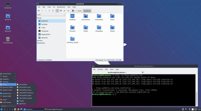
Like MATE and Cinnamon, LXDE was also based on GTK. And like their developers, LXDE’s original developer, Hong Jen Yee, didn’t like how The Gnome Team was running things. However, unlike them, what he didn’t like wasn’t how Gnome’s desktop was evolving, but the GTK toolkit itself.
Thus, he decided to start fooling around with Qt. Soon he’d ported PCManFM to Qt but claimed he’d stick with GTK. Lo and behold, he didn’t. It didn’t take long for a full Qt port of LXDE to show up. Both versions co-existed for a while, but when LXDE merged with the Razor-qt project, a new Desktop Environment was born: LXQt.
Like XFCE felt like a lighter version of Gnome 2, LXQt was until recently seen by many as a lighter KDE. However, with the modern KDE Plasma 5 being unbelievably light, LXQt’s primary selling point was lost. Today its emphasis is on its cleaner aesthetics, although some might find them too simplistic for their liking.
Even More Options
There are many Desktop Environments you can go for. Here are three of them we believe are worth checking out. We’ve included a distribution for each, where you can try them out.
- Enlightenment always looked like a desktop pulled kicking and screaming out of a distant future. It looks unlike anything else, is hugely original, relatively light on resources, and ultra-zippy. How come it’s not everywhere, then? Because it also feels somewhat clanky and incomplete, like a beta version of better things to come. You can try its Moksha spin on Bodhi Linux.
Deepin Desktop is unsurprisingly the official Desktop Environment of Deepin Linux. Aimed primarily at newcomers, it successfully balances aesthetics and accessibility. However, it lacks a bit on the customization front. Deepin isn’t based on Ubuntu, but they both use the same source, Debian, making the core experience they offer pretty similar. - IceWM is one of the lightest Desktop Environments and has been offering a straightforward classic desktop experience for over two decades. You can find it on the Debian-based (and compatible with Ubuntu) antiX distribution.
A Desktop For Everyone
Linux allows infinite customization, and the world of open-source offers multiple alternatives for practically everything. Thus, it’s almost a given you’ll find a Desktop Environment that’s perfect for you. Quite probably, it will be one from our list.
Plus, if something’s not precisely as you want it, you can always tweak it and extend it with more software. Or, if you know how to code, fork a project. Then, use it as the base for building a new desktop environment that you’ll be able to call your own.